Menu
.svg)
.svg)
.svg)
An immaculate brand transformation for Ashlee’s skincare studio — cherubs and all
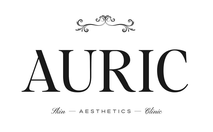
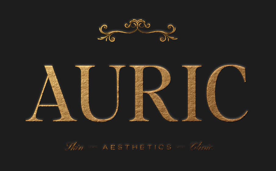
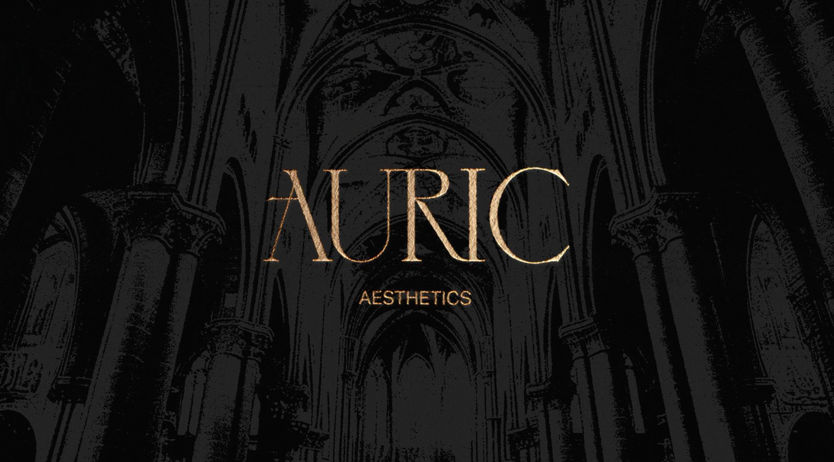
Skincare studio Auric Aesthetics
We reimagined Ashlee’s brand from a generic look to a marvelous, fully custom identity applied across print, web, and social. The result became one of our most recognized projects, earning lasting praise from both the client and her audience.
.jpg)
The Journey to a Transformed Brand
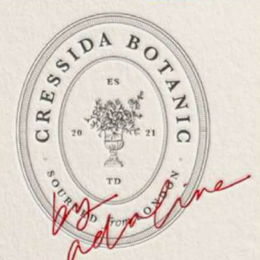
Ashlee came to us with a brand that was “pretty enough” — but not truly her
It looked nice on the surface, yet felt a bit generic and disconnected from the dark, unique energy behind her business. She knew it was time to go beyond the logos and a pattern, and build a whole visual universe.
The Initial Challenge
Ashlee came to us with a familiar frustration. She already had a brand identity that another designer had created for her, and while it wasn't terrible, it was a bit ordinary and forgettable.
She knew in her heart that her brand deserved more, that it could be something truly special, and this disconnect left her feeling unsatisfied every time she looked at her materials.

Our Approach
We developed a full brand identity that was meticulous in every detail. Each element - from the custom frames and illustrations to the typography and color palette - was crafted to create a cohesive whole.
The result was a STUNNING brand that exudes sophistication while celebrating the dark, alternative edge that was true to Ashlee's vision.
When discussing Ashlee’s clients, we found out some interesting things that directed our project:
01
They're somewhat educated on skincare and aware of the time and financial commitment. We want them to follow Ash's advice without question, so this brand has to back up her knowledge 100% from first contact.
02
They’re over impulse buying, celebrity brands, and prioritize skin health over trends, so Auric needed to feel like the opposite of mass-market beauty. We should go on a whole different visual direction.
03
They have expensive taste, are used to paying premium prices and expect quality to match, so every detail had to look genuinely high-end. People with real money can spot fake luxury instantly.
04
Being associated with the right places matters to them, so Auric needed that VIP, members-only vibe to make them proud to post about it, to tag them on their stories bc it will make THEM look good.
.png)
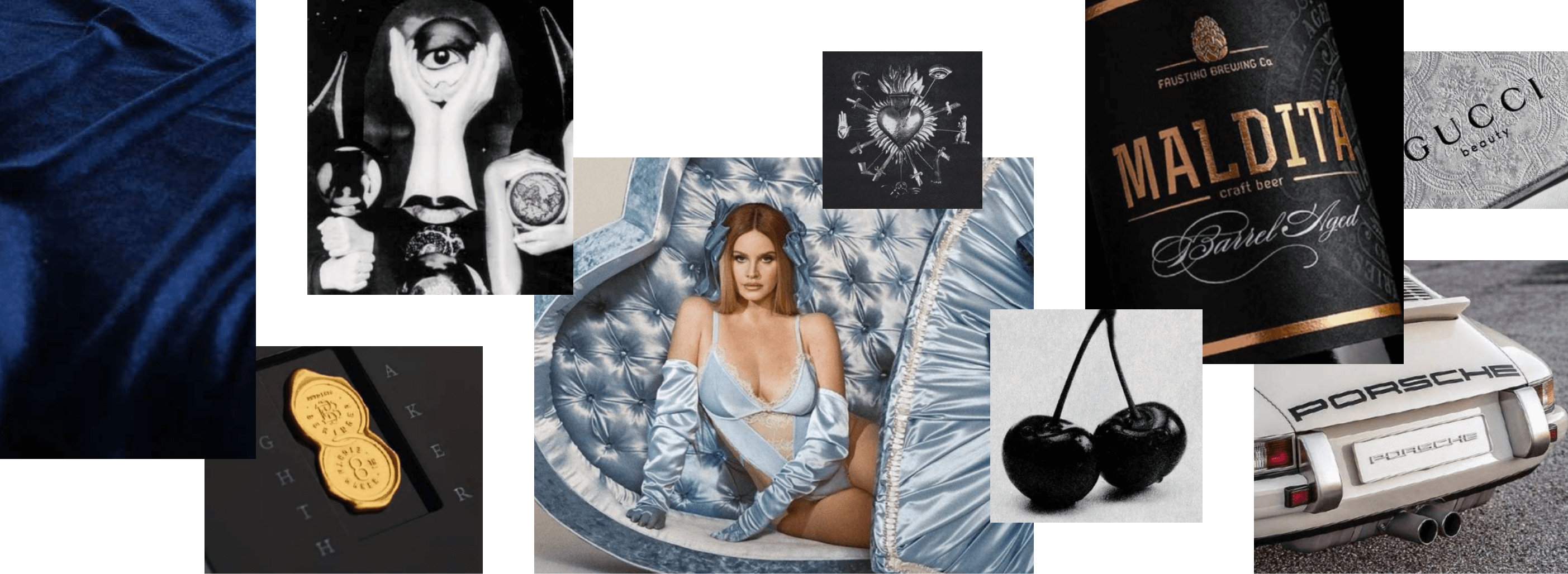
OUR CONCEPT
The base for Auric Aesthetics
.png)
And then... we made this concept visual
.jpg)
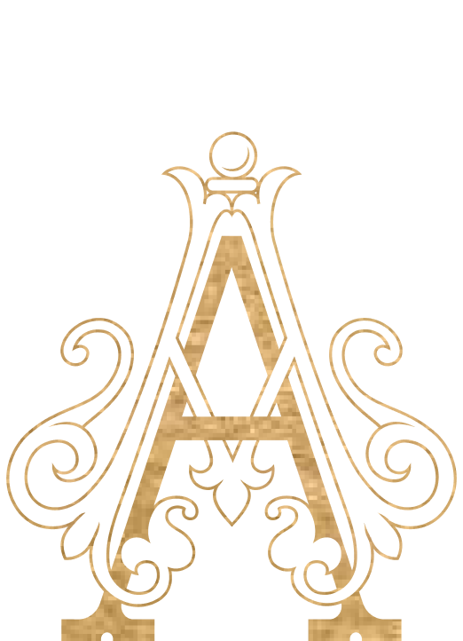
A modification to Ashlee’s current logo, making it more condensed and taller so it looks more elegant
.jpg)
A highly ornate monogram inspired by the Rococo period
.jpg)
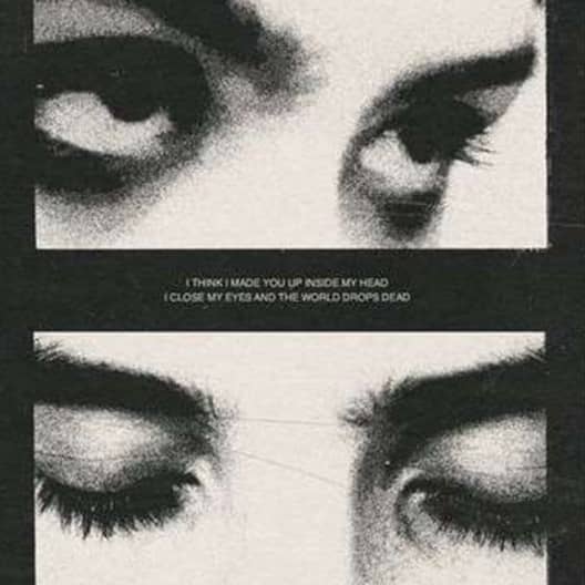
A thin serif font for titles to bring elegance and a delicate touch
.jpg)
Combined with a sans serif font (the high fashion kind!) The past and the contemporary together.
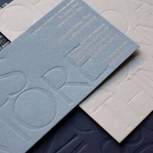
Lots of cool special finishes on print: gold foil, blind embossing, spot UV... so much to explore!
A rustic effect to the photos can create an interesting contrast with the “perfect” side of the brand
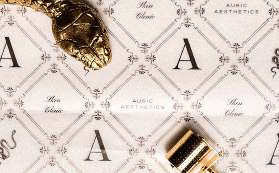
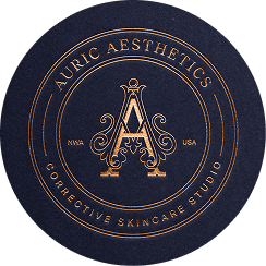
Brand Marks that allude to seals and crests that shows quality and sophistication
.png)
Ornaments inspired by the style of the Rococo period
Disclaimer: The images used in this moodboard are for inspirational purposes only and do not belong to me. They are sourced from various platforms like Pinterest and Google. All credit goes to their respective creators.
A nice but forgettable brand became a bold, unforgettable identity
We created a brand that gives Ashlee's clients a gut feeling that they can trust her blindly, and gets them in the right mindset of investing in themselves. Of treating themselves by going to this luxurious, unique place. And for Ash herself, if gave her a brand that feels like a whole lil universe that feels SO right, and is constantly inspiring her.
.png)
.png)
.png)
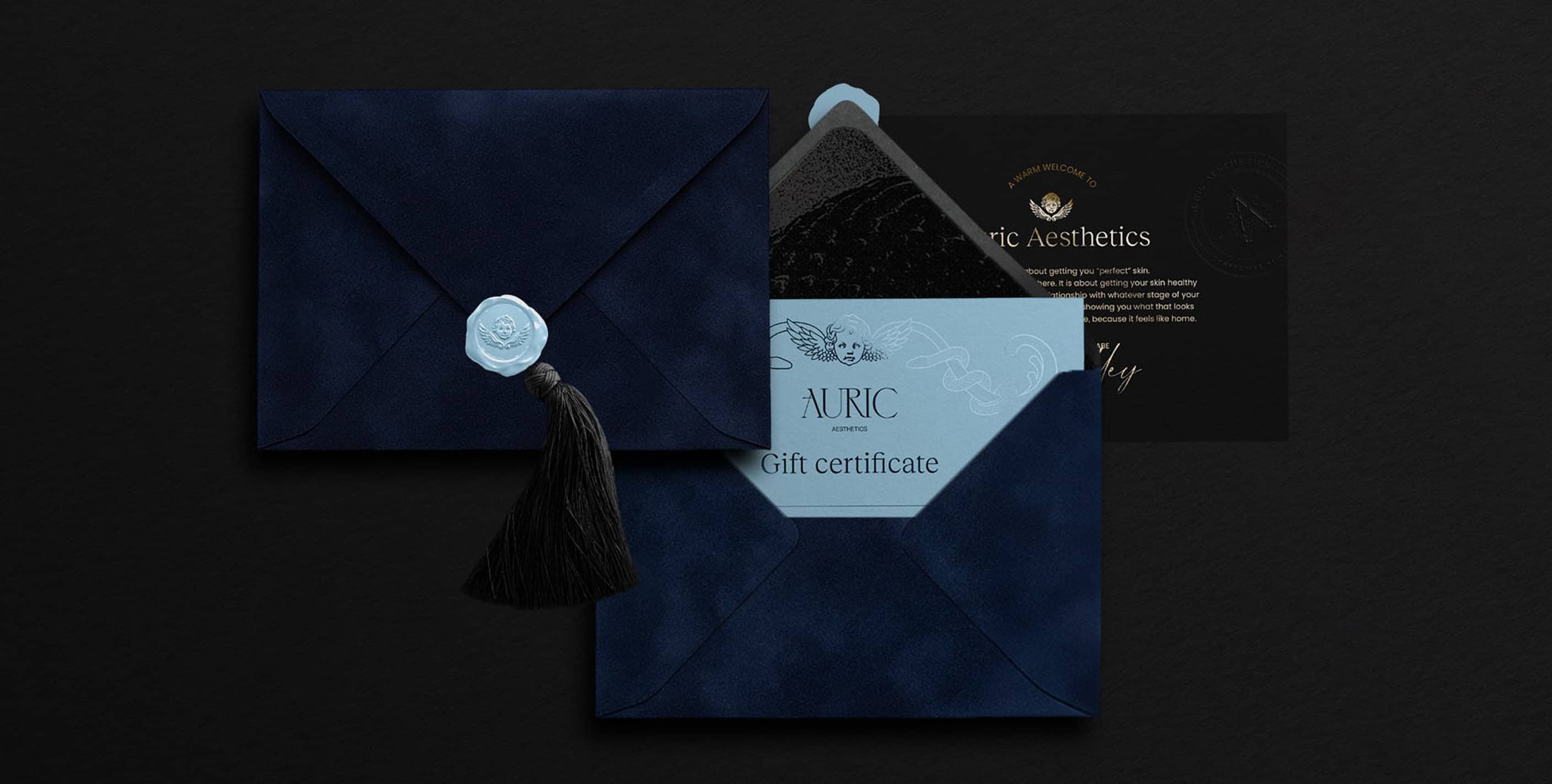
We guided the entire production process, managing relationships with printing companies
The brand implementation extended far beyond just creating the brand identity. We ensured everything from business cards to wax seals met our exacting standards. Every touchpoint was special, delivering both quality and customization that reflected the vibe of Auric Aesthetics.
Gift certificates
.jpg)
.png)
Product unboxing
.png)
Business cards
.jpg)
Envelope
Tissue paper
Thank you cards
.jpg)
Let's unbox it together


.jpg)

Virginia unboxes the stationery in 160 seconds
Social Media Templates
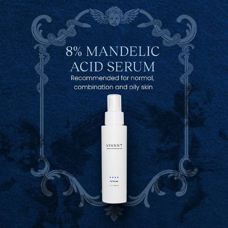
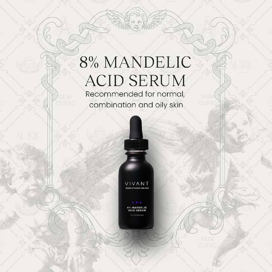
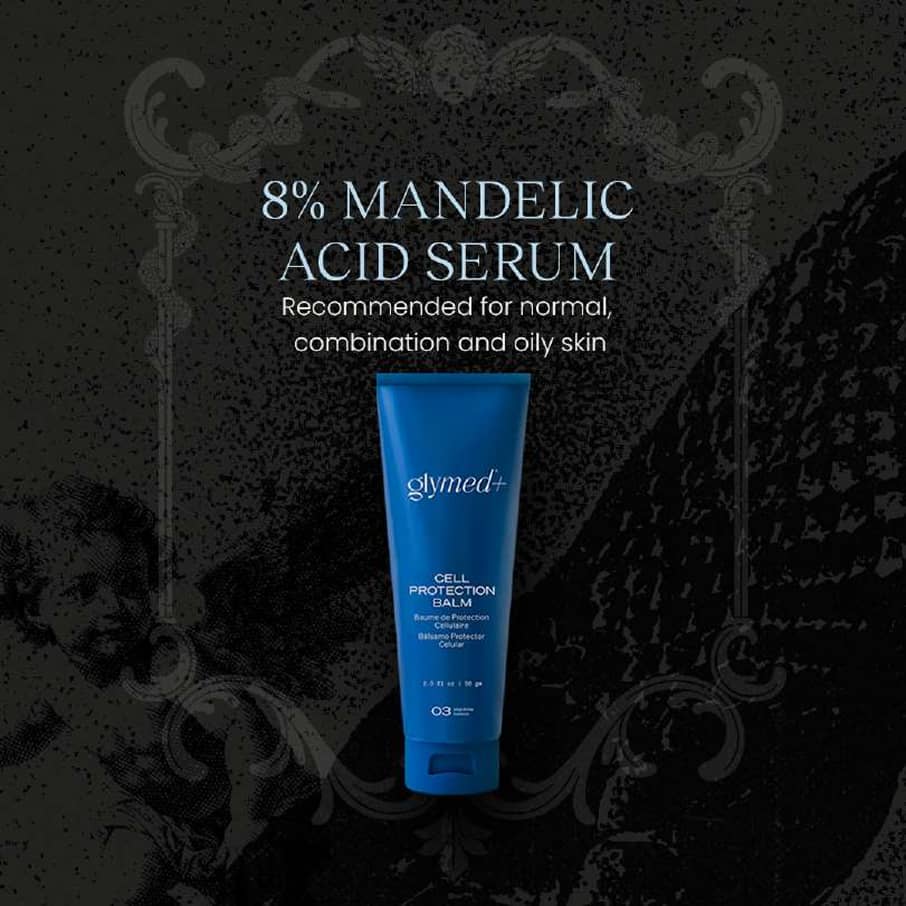
We equipped Ashlee with everything she needs to confidently manage their social presence, from ready-to-post Instagram graphics to customizable Canva templates. This way, she can stay consistently on-brand with minimal effort. Just double click the text on Canva, and start typing.
Post templates
Reel covers
Story backgrounds
.gif)
Highlight covers


Post templates
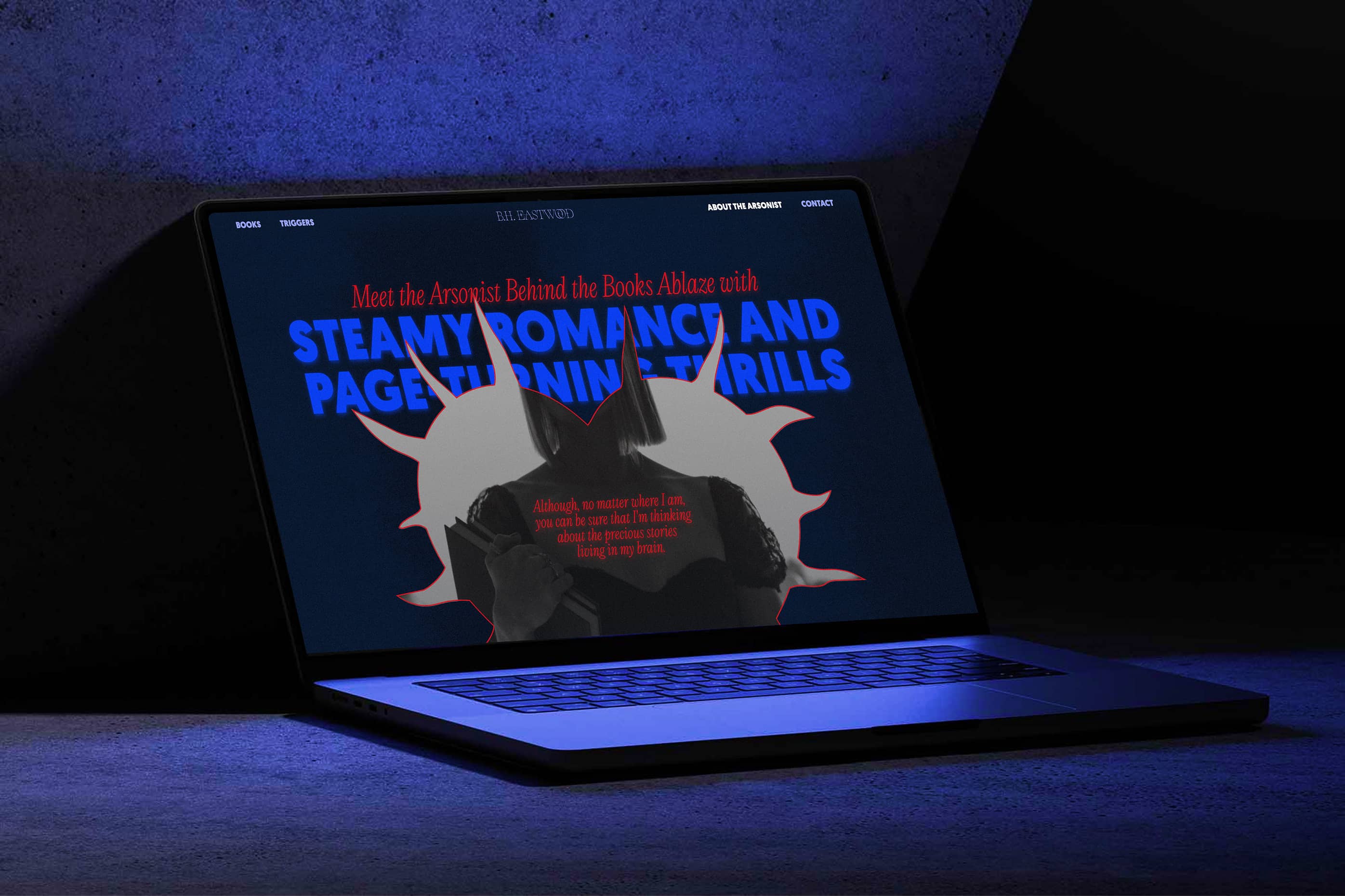
We brought her new branding to her site by updating colors, fonts...
We also customized her existing Shopify website to reflect the refreshed aesthetic. We also added a new gift card feature, enhancing both the visual experience and functionality.
.jpg)
THE IMPACT
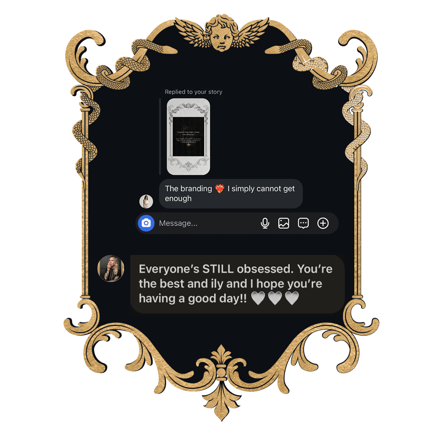
Ashlee's audience was "obsessed" with the new branding

The rebrand instantly resonated: not just with Ashlee, but with her entire audience
Compliments poured in for months after the launch, and the branding became a core part of how her business is perceived and celebrated.

Ashlee finally sees her brand as a true reflection of her personality
It no longer feels generic or “just functional,” but instead deeply aligned with her values, aesthetic, and the experience she wants to offer.

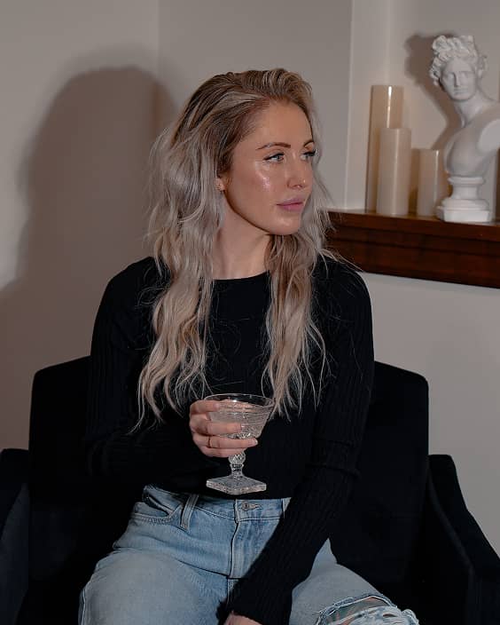
She shows up with confidence, and a signature visual style on social media
Ashlee quickly embraced the new brand with professional photoshoots and now she has a distinctive style when posting on social media
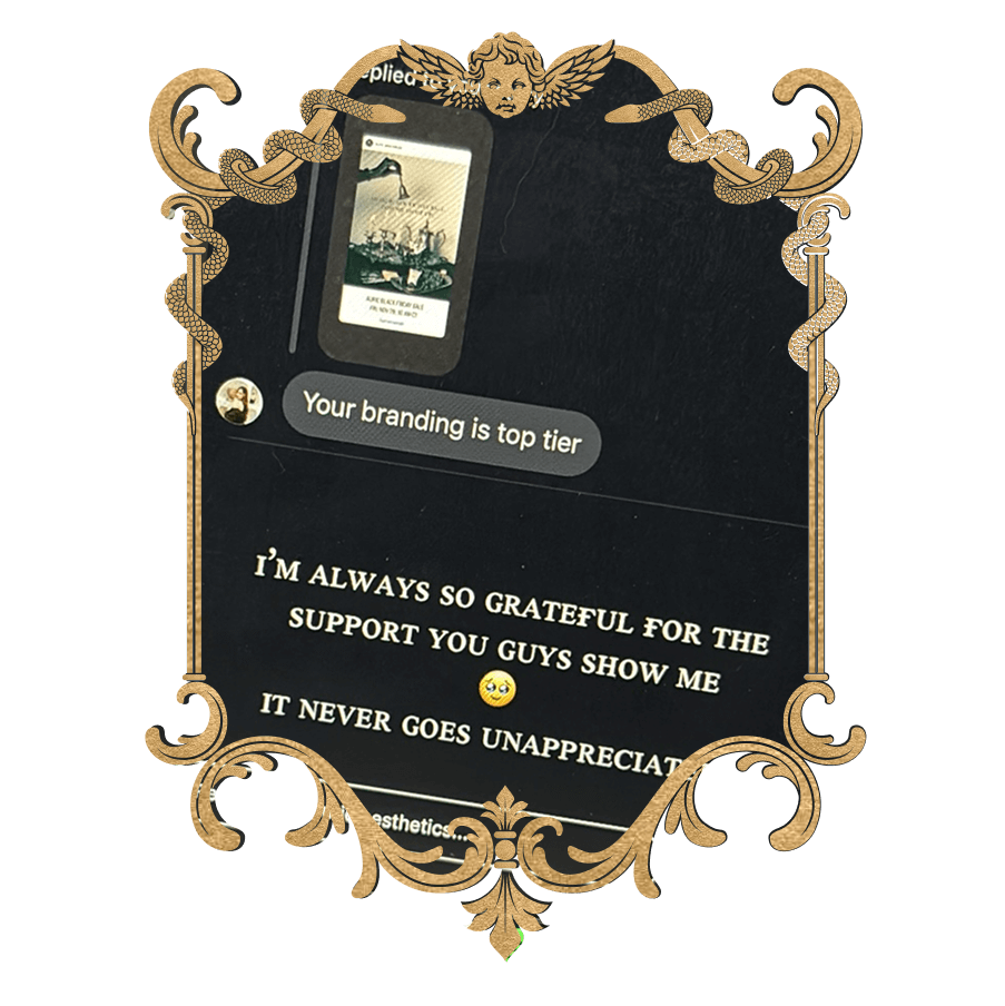

Best decision I made last year by far was working with you and your team.
Ash Kelley
Skincare Studio Founder
Would you like to have us transform your brand like we did for this client?


.jpg)
.jpg)
.jpg)

%20(1)%20(1).gif)