
industry
Dark Romance Author
what we did

Dark romantic suspense novels that will have you on the edge of your seat and scald your heart in the best way.

.jpg)
When BH Eastwood came to us, she was in a familiar position to many first-time authors. As a “debut author”, she had no previously published books and no established brand presence. What she did have was a clear vision of what she didn't want: to enter the literary world unprepared or looking amateurish.

explained BH during our initial contact. It was essential for her to present herself to the market with a professional identity that properly reflected her work.
.jpg)
.jpg)
After talking to BH about her business goals, we developed a customized branding package that addressed all aspects of her professional presence. Our focus was to guide her through each step of the process, ensuring that every element of her brand was coherent, consistent and attractive to her desired audience.
Our approach consisted of 3 parts.

They seek content about the books and characters online to continue expanding their experience with the story they read. Very passionate readers = engaged fanbase = we need to prepare all of BH's online touchpoints for them (socials, email newsletter... everything should look professional and inviting upon their arrival)
They know what they want and are already familiarized with the dark romance genre (and the graphic content that comes with it), so we're not shying away from that in the branding.
They want stories that stick with them long after they read the last page of the book. So we wanted to give them a brand that would help immerse them in the author's universe, and signal right away that this will be an entrancing experience.
They are almost always women, who are "serial readers", and very active in online book communities like Booktok. Since they're familiar with what brands in this niche look like, and we wanted to hit those familiar notes with the visuals of BH's brand.
.png)
.jpg)
.png)

Her writing burns with a dark, intense, and seductive energy—so fierce it feels like fire turned blue. Each story she crafts is a plunge into raw emotion and high-stakes tension, led by powerful, unforgettable women.
Her worlds may shift — from shipwrecks to shadowy academies to brutal government prisons—but the heart of her work never wavers. It's always bold. Always unapologetic. Always driven by the strength of her characters and the weight of the emotions they carry.
This intensity doesn’t just shape her stories — it defines her voice as an author. And it’s the same force that inspired the visual identity: a blend of bold typography and deep, charged color, echoing the fire behind every page she writes.
.png)
.jpg)
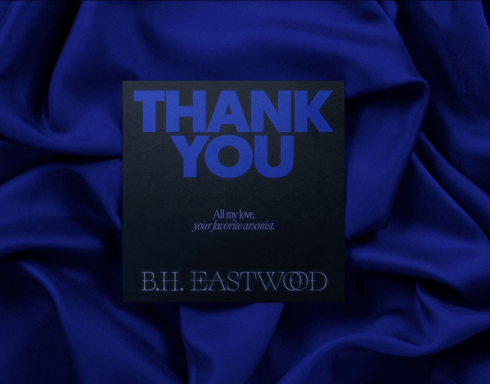
Black stands at the center of her brand—timeless, dramatic, and full of depth. It sets the tone for the darkness in her stories, while making room for other colors to cut through with meaning and impact.
.jpg)
Inspired by the rare beauty of blue fire, this color embodies mystery, seduction, and emotional heat. Just like her writing, it’s cool on the surface—but burns dangerously hot underneath.
.jpg)
Red is not only very intense — exactly what we wanted for this brand — but also a trademark color in the dark romance niche, so we wanted to use it to hit those familiar notes in the genre
.jpg)
One of the brand’s signature icons will be the “dark heart”—a symbol that captures the duality of her narratives: love wrapped in danger, vulnerability entwined with strength.
.jpg)
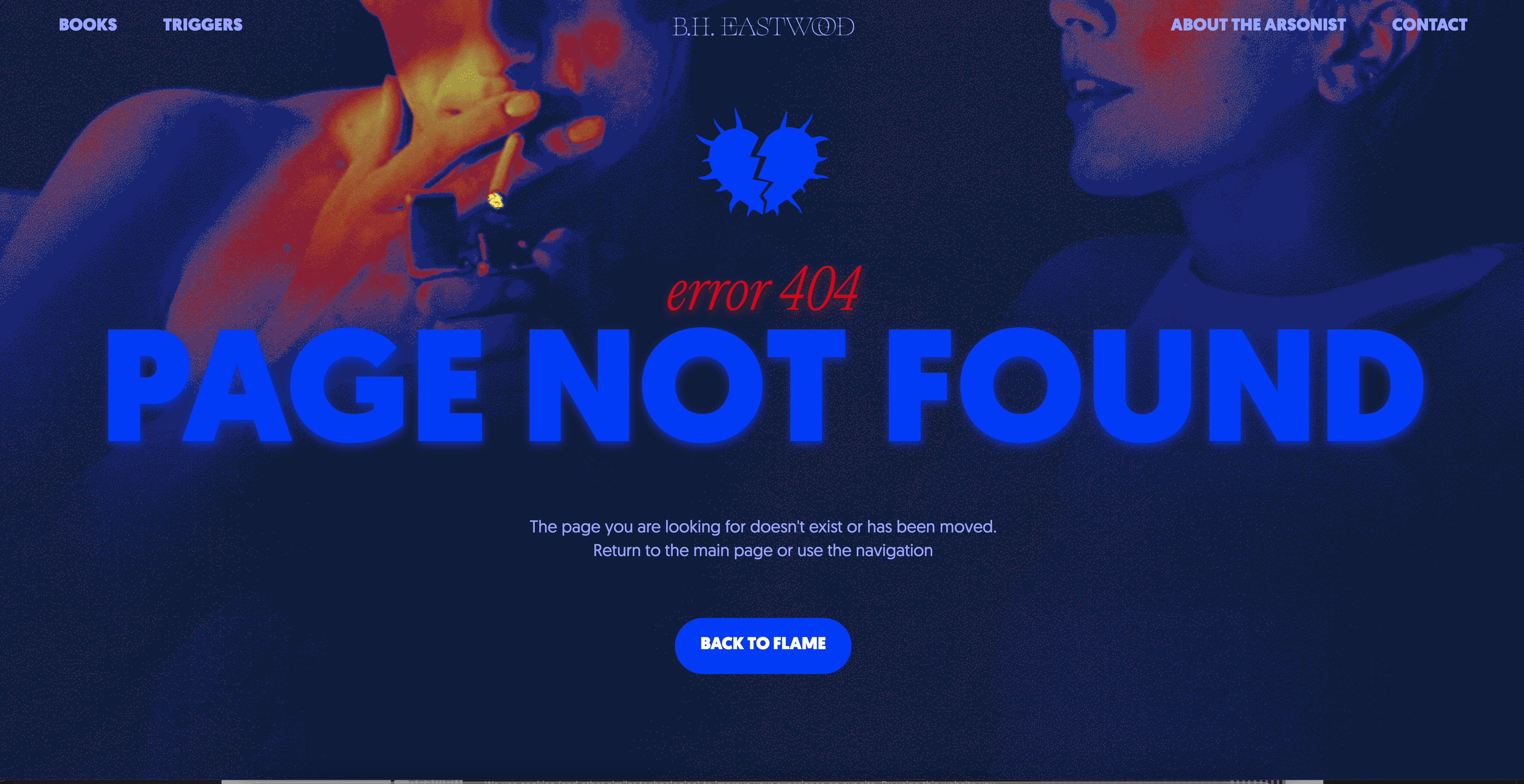
We wanted to incorporate the element of fire to emphasize the spiciness and intensity that live in her stories—and in every woman who leads them.
.jpg)
To balance the elegance, we’ll bring in a chunky, statement font that represents the fearless women at the heart of her work—loud, unapologetic, and impossible to ignore.
.jpg)
A thin, serif font will be used for titles and the logo paired with a thin serif font to help build that elegant, mysterious atmosphere we want.
.jpg)
A soft light blue glow paired with subtle blur effects will layer intrigue into the visuals—like a haze of smoke, or a secret just out of reach. It adds depth and pulls the viewer into her world.
.jpg)
Thorns will subtly inspire the logo design, referencing the dark, twisted edges of her love stories. Beauty with a bite—just like her fiction.
.jpg)
Grainy textures will tie everything together, adding richness to the backgrounds. Paired with chrome, it creates a visual rhythm that feels raw, real, and full of emotion.
.jpg)
To echo the gritty, unapologetic nature of her writing, a touch of chrome will be used across brand visuals. It adds toughness, contrast—and just the right amount of tension.
.jpg)
What made this collaboration especially meaningful was how understood BH felt throughout the process. As an author of dark novels, she found in our team a partner who understood the essence of her work.This deep understanding resulted in a brand that not only looked professional, but truly captured the essence of her books.
.png)
.png)

The branding for B.H. Eastwood is a bold, visceral reflection of her stories—dark, seductive, and emotionally charged. Every element was crafted to embody the intensity of her writing and the unapologetic power of her female characters.
As part of the visual storytelling, fire became a central metaphor throughout the brand. Whether used literally or symbolically, the flame effect visually communicates the raw, emotional burn that B.H. Eastwood’s readers will know and love.
We managed the whole process with the printing companies to produce the physical materials, checking proofs and ensuring that they strictly followed the standards of the new visual identity. When the materials arrived, BH confirmed that ‘everything was beautiful’.
.png)
.jpg)
The result was a transformation that exceeded BH's expectations.
More than just the visual elements, BH found something even more valuable: a deep connection with her own brand. As she herself shared:
.png)
She specifically highlighted the elements that impressed her the most: the colors, the fonts, the logo, the chrome and glitter, the thermal imaging, EVERYTHING!!!!
.png)
.jpg)
.png)
.jpg)
.png)
We also worked with the printing company to produce the physical materials, ensuring that they strictly followed the standards of the new visual identity. When the materials arrived, BH confirmed that “everything was beautiful”.
.jpg)
.jpg)
To make B.H. Eastwood’s pictures uniform and harmonic with her brand colors, we can use a preset. We set up two presets: one that turns her picture black and white and grainy, and another that brings out “heat mapˮ effect in the pictures.
Quotes, Cover Reveal, Events/signings, Reviews
.jpg)
.jpg)
.jpg)
.jpg)
.jpg)
With all the brand elements developed, we moved on to the implementation phase. We launched the website, set up the newsletters and instructed BH on how to manage the elements we couldn't implement directly. She passed these guidelines on to her assistant, and soon everything was working exactly as she had envisioned.
From the moment the page loads, the experience is bold, atmospheric, and emotionally charged — just like B.H. Eastwood’s books.
.jpg)
.jpg)
.jpg)
.png)
.png)
After designing her brand identity, we immediately moved on to the site, where we figured out the pages, navigation, and organized all the necessary content in an intuitive way for her visitors. We also made sure to include animations and little easter eggs to delight her readers even more.
.png)
BH gained confidence in her professional identity, feeling truly represented by every element created. The experience, which she repeatedly described as “wonderful”, gave her all the tools she needed to launch her work into the world with quality and authenticity.
Today, BH is not just a first-time author - she is an author with a professional brand presence who stands out in her niche, accurately communicates her unique voice and creates a genuine connection with her audience.
As she herself stated, it confirms that her decision to invest in a professional identity from the outset was the right one:

Dark Romance Author


